
Los botones se han convertido en una parte imprescindible del desarrollo de frontales. Por tanto, es importante tener en cuenta varías cosas antes de dar estilo a los botones. He reunido algunas de las maneras de darles estilo usando CSS. Podemos combinar también la mayoría de métodos para crear un nuevo estilo. Para crear CSS para degradados, podemos usar https://uigradients.com.
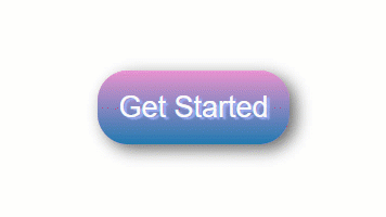
Un sencillo botón «Primeros pasos»
|
1 2 3 |
.btn { background: #eb94d0; |
/* Crear degradados */
|
1 2 3 4 5 |
background-image: -webkit-linear-gradient(top, #eb94d0, #2079b0); background-image: -moz-linear-gradient(top, #eb94d0, #2079b0); background-image: -ms-linear-gradient(top, #eb94d0, #2079b0); background-image: -o-linear-gradient(top, #eb94d0, #2079b0); background-image: linear-gradient(to bottom, #eb94d0, #2079b0); |
/* Dar bordes curvados a btn */
|
1 2 3 4 5 6 7 8 9 10 11 12 13 14 15 |
-webkit-border-radius: 28; -moz-border-radius: 28; border-radius: 28px; text-shadow: 3px 2px 1px #9daef5; -webkit-box-shadow: 6px 5px 24px #666666; -moz-box-shadow: 6px 5px 24px #666666; box-shadow: 6px 5px 24px #666666; font-family: Arial; color: #fafafa; font-size: 27px; padding: 19px; text-decoration: none; } |
/* Al poner el curso encima (hover) */
|
1 2 3 4 5 6 7 8 9 10 11 12 |
.btn:hover { background: #2079b0; background-image: -webkit-linear-gradient(top, #2079b0, #eb94d0); background-image: -moz-linear-gradient(top, #2079b0, #eb94d0); background-image: -ms-linear-gradient(top, #2079b0, #eb94d0); background-image: -o-linear-gradient(top, #2079b0, #eb94d0); background-image: linear-gradient(to bottom, #2079b0, #eb94d0); text-decoration: none; } |
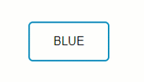
Botón con fondo transparente
|
1 |
.btn { |
/* Color del texo */
|
1 |
color: #0099CC; |
/* Eliminar color de fondo */
|
1 |
background: transparent; |
/* Grosor del borde, estilo de línea y color */
|
1 |
border: 2px solid #0099CC; |
/* Añadir esquinas curvadas */
|
1 |
border-radius: 6px; |
/* Poner texto en mayúsculas */
|
1 2 3 4 5 6 7 8 9 10 11 12 13 14 15 16 17 18 |
border: none; color: white; padding: 16px 32px; text-align: center; display: inline-block; font-size: 16px; margin: 4px 2px; -webkit-transition-duration: 0.4s; /* Safari */ transition-duration: 0.4s; cursor: pointer; text-decoration: none; text-transform: uppercase; } .btn1 { background-color: white; color: black; border: 2px solid #008CBA; } |
/* Al poner el curso encima (hover) */
|
1 2 3 4 |
.btn1:hover { background-color: #008CBA; color: white; } |
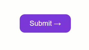
Botón con entidades CSS
Puedes encontrar el listado completo de entidades CSS aquí (en inglés)
https://www.w3schools.com/cssref/css_entities.asp
También puedes usar entidades HTML, pero están limitadas.
https://www.w3schools.com/html/html_entities.asp
|
1 2 3 4 5 6 7 8 9 10 11 12 13 14 15 16 17 18 19 20 21 22 23 24 25 26 27 28 29 30 31 32 33 34 35 36 37 38 39 40 41 |
.button { display: inline-block; border-radius: 4px; background-color: #f4511e; border: none; color: #FFFFFF; text-align: center; font-size: 28px; padding: 20px; width: 200px; transition: all 0.5s; cursor: pointer; margin: 5px; } .button span { cursor: pointer; display: inline-block; position: relative; transition: 0.5s; } .button span:after { content: '\00bb'; /* Entidades CSS. Para usar entidades HTML, use →*/ position: absolute; opacity: 0; top: 0; right: -20px; transition: 0.5s; } .button:hover span { padding-right: 25px; } .button:hover span:after { opacity: 1; right: 0; } |
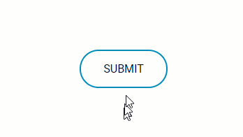
Botón con animación al hacer clic
CSS: (SCSS)
|
1 2 3 4 5 6 7 8 9 10 11 12 13 14 15 16 17 18 19 20 21 22 23 24 25 26 27 28 29 30 31 32 33 34 35 36 37 38 39 40 41 42 43 44 45 46 47 48 49 50 51 52 53 54 55 56 57 58 59 60 61 62 63 64 65 66 67 68 69 70 71 72 73 74 75 76 77 78 79 80 81 82 83 84 85 86 87 88 89 90 91 92 93 94 95 96 97 98 99 100 101 102 103 104 105 |
$gray: #bbbbbb; * { font-family: 'Roboto', sans-serif; } .container { position: absolute; top:50%; left:50%; margin-left: -65px; margin-top: -20px; width: 130px; height: 40px; text-align: center; } .btn { color: #0099CC; /*Color texto */ background: transparent; /* Eliminar color de fondo */ border: 2px solid #0099CC; /* Ancho de borde, estilo de línea y color */ border-radius: 70px; /* Esquinas redondeadas */ text-decoration: none; text-transform: uppercase; /* Mayúsculas */ border: none; color: white; padding: 16px 32px; text-align: center; text-decoration: none; display: inline-block; font-size: 16px; margin: 4px 2px; -webkit-transition-duration: 0.4s; /* Safari */ transition-duration: 0.4s; cursor: pointer; } .btn1 { background-color: white; color: black; border: 2px solid #008CBA; } .btn1:hover { background-color: #008CBA; color: white; } b { outline:none; height: 40px; text-align: center; width: 130px; border-radius:100px; background: #fff; border: 2px solid #008CBA; color: #008CBA; letter-spacing:1px; text-shadow:0; font:{ size:12px; weight:bold; } cursor: pointer; transition: all 0.25s ease; &:active { letter-spacing: 2px ; } &:after { content:""; } } .onclic { width: 10px !important; height: 70px !important; border-radius: 50% !important; border-color:$gray; border-width:4px; font-size:0; border-left-color: #008CBA; animation: rotating 2s 0.25s linear infinite; &:hover { color: dodgerblue; background: white; } } .validate { content:""; font-size:16px; color: black; background: dodgerblue; border-radius: 50px; &:after { font-family:'FontAwesome'; content:" done \f00c"; } } @keyframes rotating { from { transform: rotate(0deg); } to { transform: rotate(360deg); } } |
Javascript: (JQuery)
|
1 2 3 4 5 6 7 8 9 10 11 12 13 14 15 16 17 |
$(function() { $("#button").click(function() { $("#button").addClass("onclic", 250, validate); }); function validate() { setTimeout(function() { $("#button").removeClass("onclic"); $("#button").addClass("validate", 450, callback); }, 2250); } function callback() { setTimeout(function() { $("#button").removeClass("validate"); }, 1250); } }); |
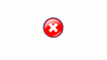
Botón con imagen
|
1 2 3 4 5 6 7 8 9 10 11 12 13 14 15 16 17 18 19 20 |
.btn { background: #92c7eb; background-image: url(“http://res.freestockphotos.biz/pictures/15/15107-illustration-of-a-red-close-button-pv.png"); background-size: cover; background-position: center; display: inline-block; border: none; padding: 20px; width: 70px; border-radius: 900px; height: 70px; transition: all 0.5s; cursor: pointer; } .btn:hover { width: 75px; height: 75px; } |
Botones con iconos
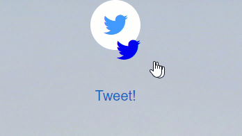
index.html
|
1 2 3 |
<div class="main"><button class="button" style="vertical-align:middle"><a href="#" class="icon-button twitter"><i class="icon-twitter"></i><span></span></button></a> <div class="text"><strong>TWEET!</strong></div> </div> |
style.css
|
1 2 3 4 5 6 7 8 9 10 11 12 13 14 15 16 17 18 19 20 21 22 23 24 25 26 27 28 29 30 31 32 33 34 35 36 37 38 39 40 41 42 43 44 45 46 47 48 49 50 51 52 53 54 55 56 57 58 59 60 61 62 63 64 65 66 67 68 69 70 71 72 73 74 75 76 77 78 79 80 81 82 83 84 85 86 87 88 89 90 91 92 93 94 95 96 97 98 99 100 101 |
button{ border: none; border-radius: 50px; } html, body { font-size: 20px; min-height: 100%; overflow: hidden; font-family: "Helvetica Neue", Helvetica, sans-serif; text-align: center; } .text { padding-top: 50px; font-family: "Helvetica Neue", Helvetica, 'Lucida Sans Unicode', Geneva, Verdana, sans-serif; } .text:hover { cursor: pointer; color: #1565C0; } .main { padding: 0px 0px 0px 0px; margin: 0; background-image: url("https://someimg"); text-align: center; background-size: 100% !important; background-repeat: no-repeat; width: 900px; height: 700px; } .icon-button { background-color: white; border-radius: 3.6rem; cursor: pointer; display: inline-block; font-size: 2rem; height: 3.6rem; line-height: 3.6rem; margin: 0 5px; position: relative; text-align: center; -webkit-user-select: none; -moz-user-select: none; -ms-user-select: none; user-select: none; width: 3.6rem; } .icon-button span { border-radius: 0; display: block; height: 0; left: 50%; margin: 0; position: absolute; top: 50%; -webkit-transition: all 0.3s; -moz-transition: all 0.3s; -o-transition: all 0.3s; transition: all 0.3s; width: 0; } .icon-button:hover span { width: 3.6rem; height: 3.6rem; border-radius: 3.6rem; margin: -1.8rem; } .twitter span { background-color: #4099ff; } /* Icons */ .icon-button i { background: none; color: white; height: 3.6rem; left: 0; line-height: 3.6rem; position: absolute; top: 0; -webkit-transition: all 0.3s; -moz-transition: all 0.3s; -o-transition: all 0.3s; transition: all 0.3s; width: 3.6rem; z-index: 10; } .icon-button .icon-twitter { color: #4099ff; } .icon-button:hover .icon-twitter { color: white; } |
Conclusión
En este tutorial hemos aprendido a personalizar botones usando CSS y algo de JavaScript en el caso que sea necesario una función ‘después del clic’. También puedes usar CSS3ButtonGenerator para generar botones sencillos. Contacta conmigo si tienes alguna dudad.
Si te ha gustado este artículo y te ha ayudado, !puedes darme algún aplauso!
Nota: puedes encontrar el artículo original en https://medium.freecodecamp.org/a-quick-guide-to-styling-buttons-using-css-f64d4f96337f
Pingback: Por qué Angular (2, 4, 5 y 6) no mola – Developing in Spanish
Muy buena guía, gracias!